SmartMYX
BODi, formerly known as SmartMYX, is a fitness application integrating hardware and software to deliver immersive, real-time workouts. After its acquisition by Beachbody, the app underwent a complete look & feel redesign across its entire flow — from exercise selection to post-workout — focusing on visual consistency, dynamic interactions, and a premium user experience.
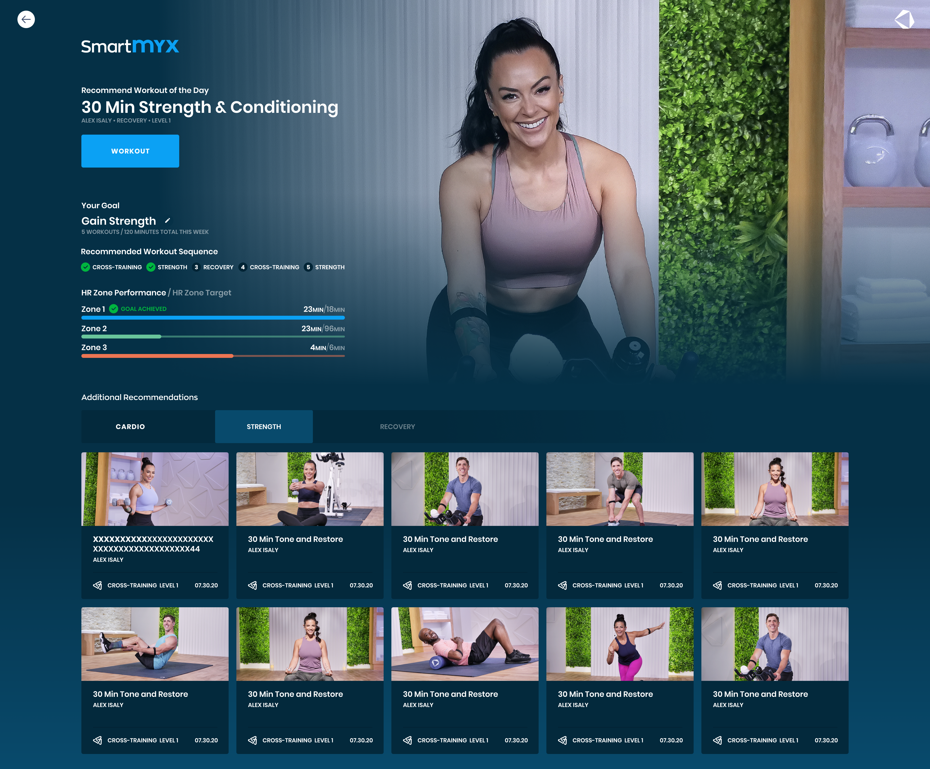
Full UI refresh with optimized typography and Lottie animations
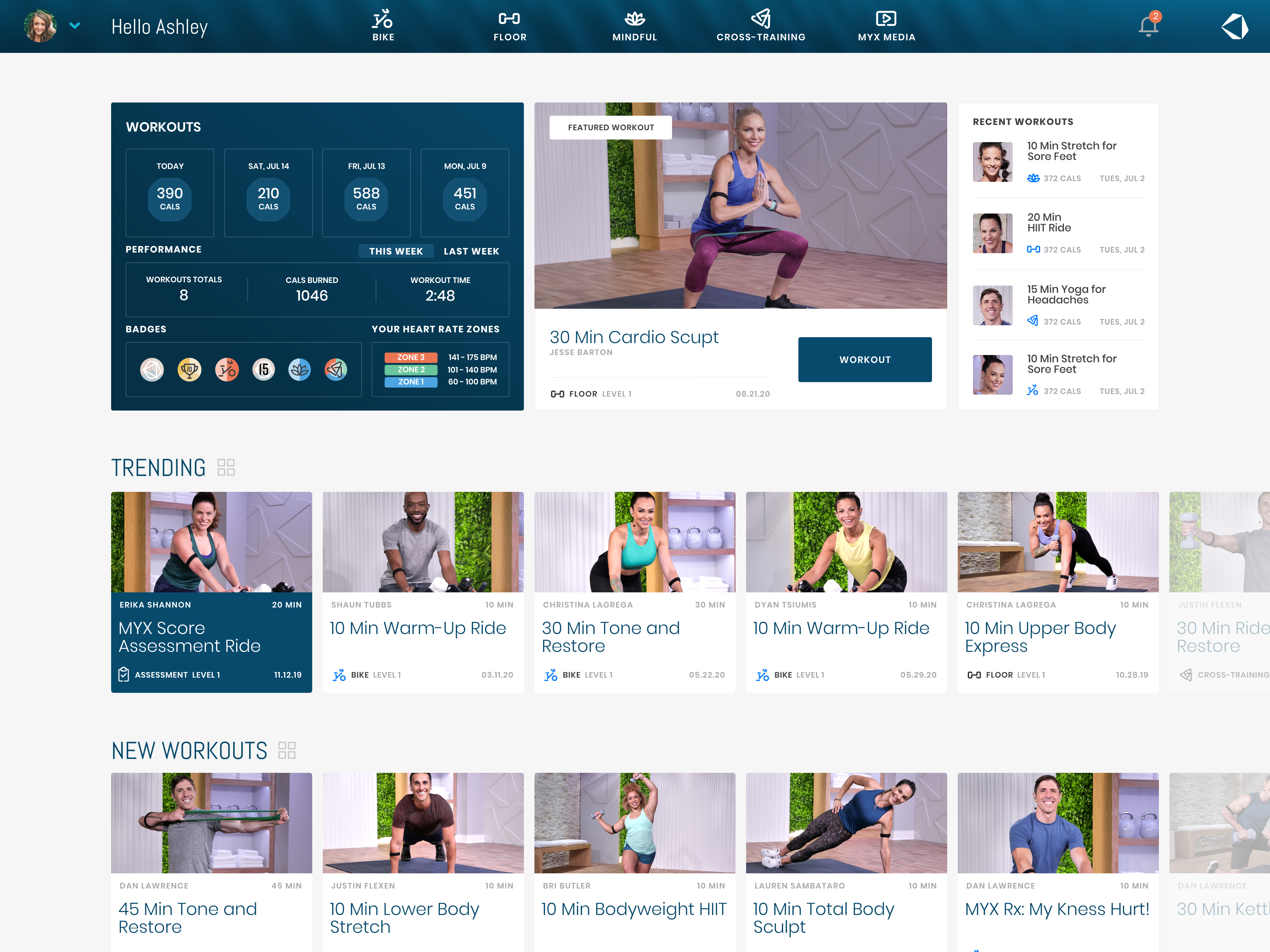
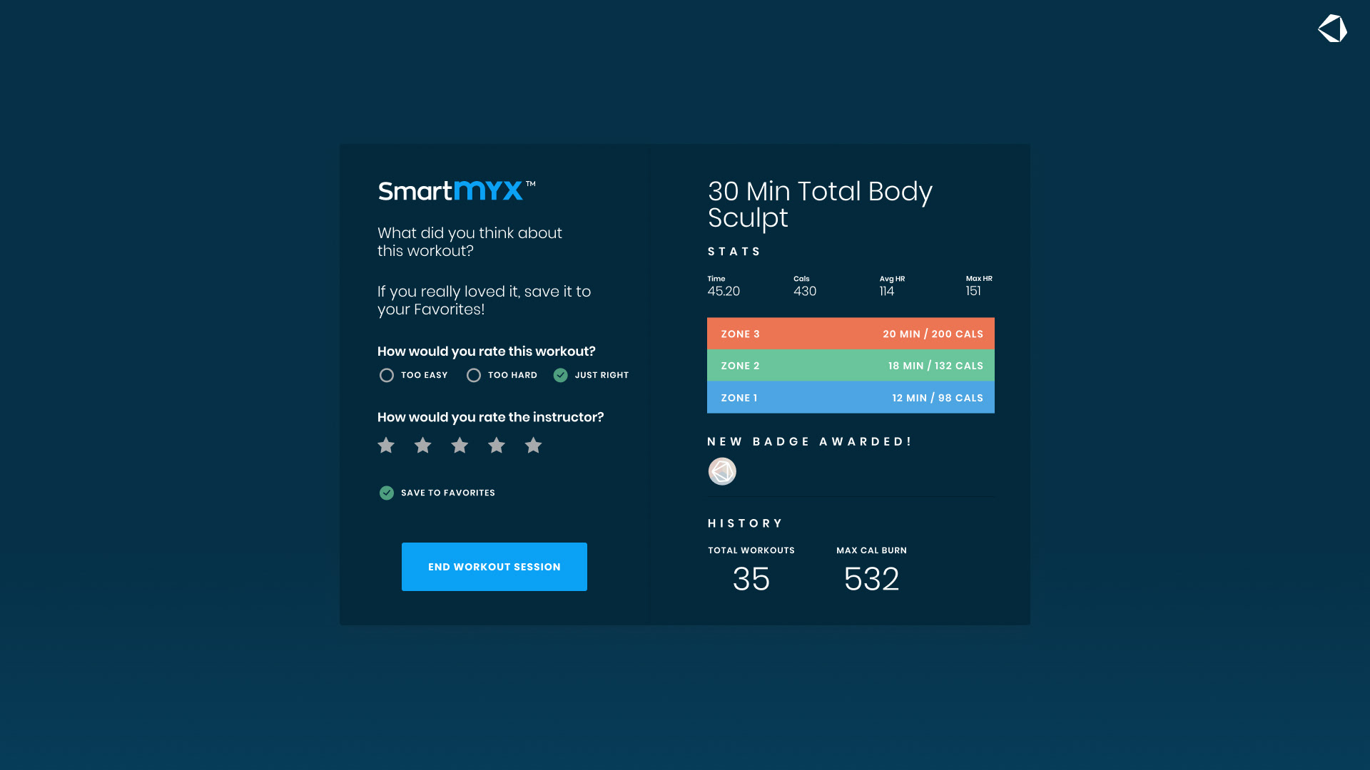
The redesign replaced the proportional typeface with a tabular one to ensure stable timers, while also refreshing the color palette, layout structures, and component styling across all screens. Custom animations were created in After Effects, exported to JSON via Lottie, and integrated into key moments such as loading screens, exercise transitions, and post-session summaries. These updates modernized the interface, improved usability, and reinforced BODi’s positioning as a high-end fitness brand.
Problem
Before its rebranding as BODi, the SmartMYX fitness app faced a fragmented user experience. The existing look & feel lacked consistency across the flow, and the use of a proportional typeface in workout timers caused distracting width changes as numbers updated in real time. Combined with static visual elements and limited motion design, the interface did not fully convey the high-energy, premium brand experience expected from an interactive fitness platform.
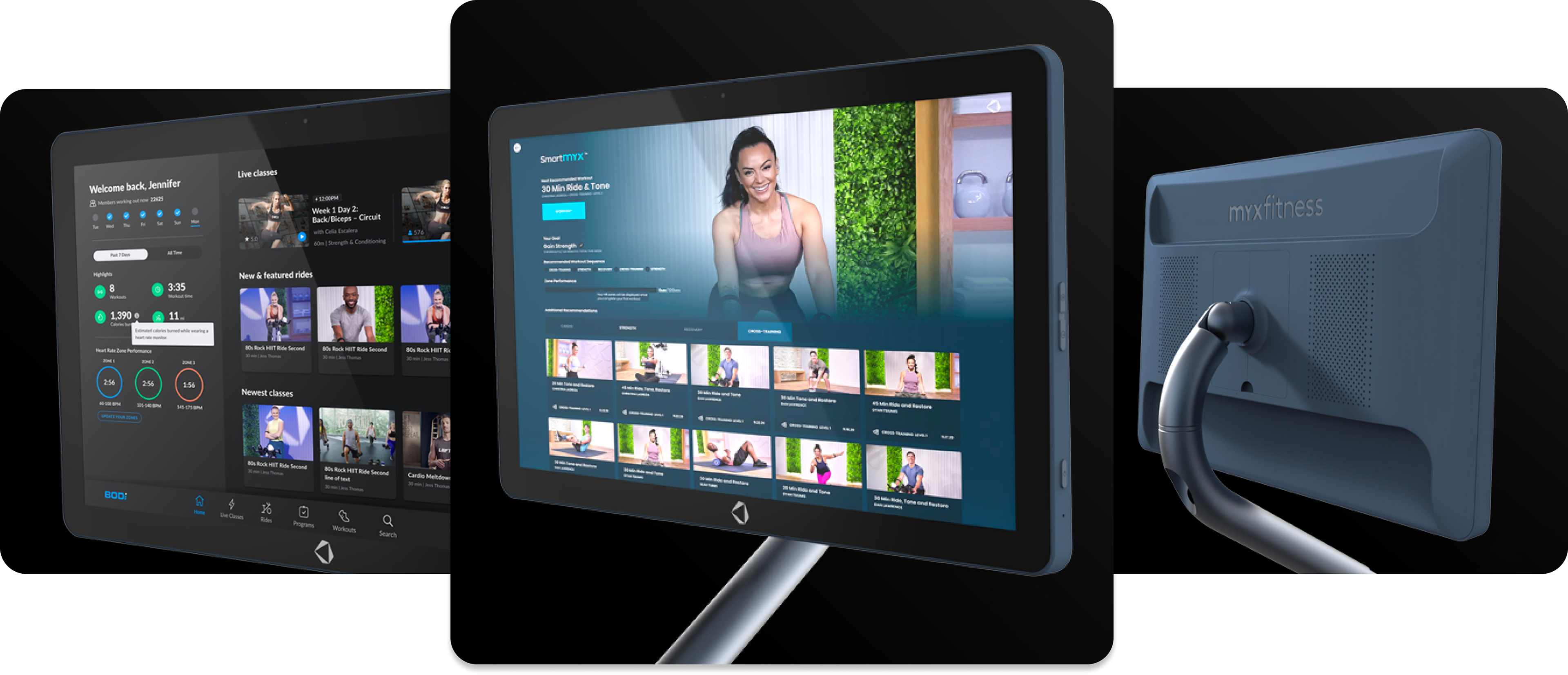
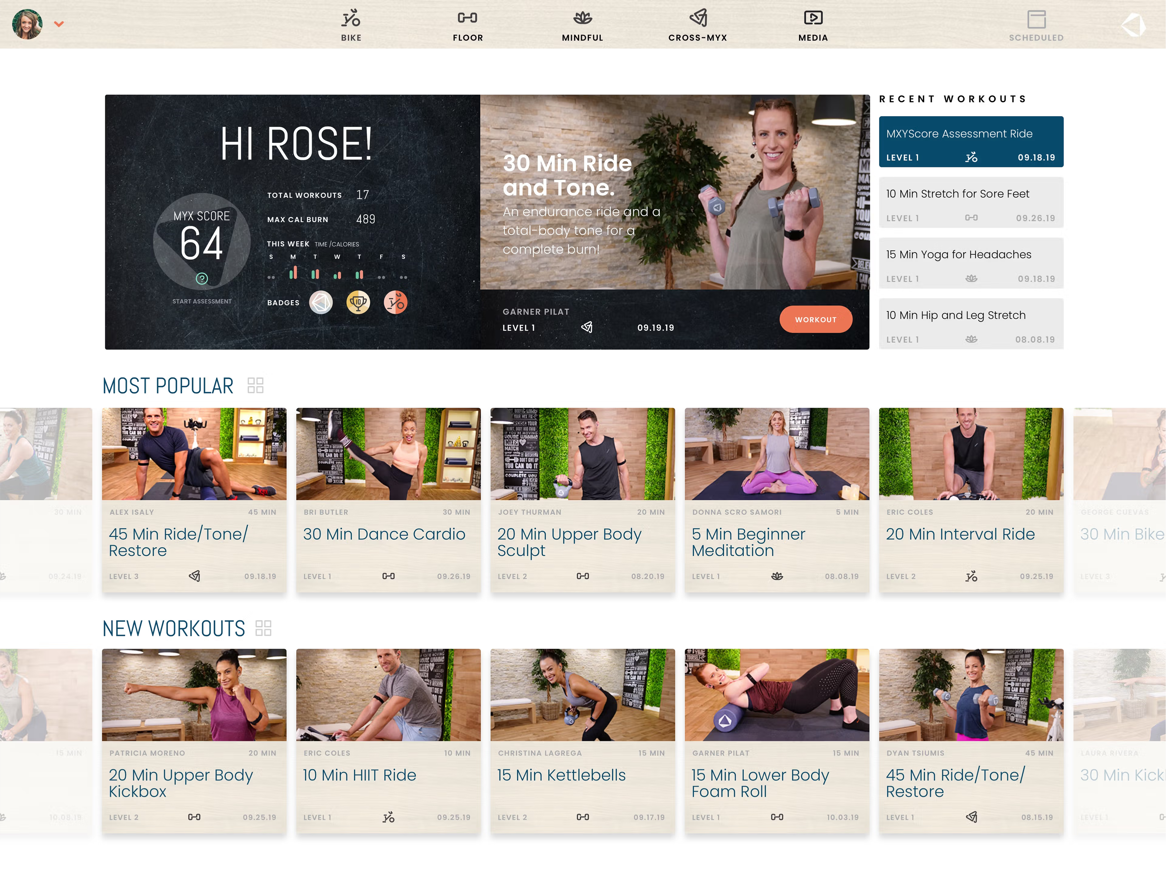
Old App version
Process
Following the Beachbody acquisition, we conducted a complete visual overhaul of the app, ensuring design consistency from the exercise selection stage to post-workout summaries.
Typography Optimization: Replaced the proportional typeface with a tabular font, ensuring stable and consistent timer display during dynamic updates.
UI Look & Feel Refresh: Updated the color palette, layout hierarchy, and component styling for a more cohesive, modern interface.
Motion & Interaction Design: Created custom animations in After Effects, exported them as JSON via Lottie, and integrated them into key user flows — including loading states, workout transitions, and post-session feedback.
User Experience Enhancement: Improved visual rhythm, reduced distraction during workouts, and reinforced the app’s high-end fitness positioning.
Solution
The redesign transformed BODi into a visually cohesive, high-performance fitness app. The tabular typography stabilized critical workout timers, custom Lottie animations added energy and brand personality, and the refreshed look & feel elevated the overall user experience. As a result, the app now reflects Beachbody’s premium brand standards while delivering a seamless and motivating workout journey from start to finish.
This case study includes only the elements I’m allowed to share under existing NDA agreements. Certain proprietary details and internal documentation have been intentionally omitted.